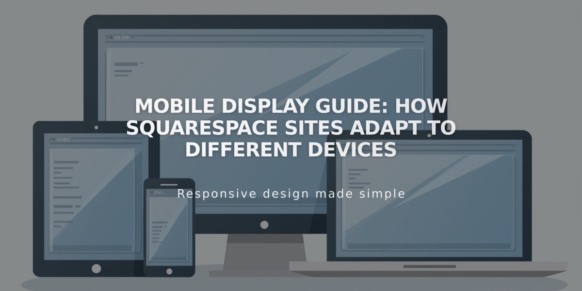
Mobile Display Guide: How Squarespace Sites Adapt to Different Devices
Mobile Display Guide for Squarespace Sites
Squarespace sites automatically adapt to all devices through responsive design, which resizes content based on screen size. Content typically stacks vertically on mobile for easy scrolling.
Key Mobile Display Features:
- Responsive design automatically adjusts layouts
- Mobile-optimized for better SEO performance
- Content stacks vertically for easy navigation
- Header elements compress into mobile-friendly format
- Gallery and image displays adapt to screen size
Testing Your Mobile Site:
- Use Device Preview tool while editing
- Test on multiple physical mobile devices
- Check site URL directly on mobile browsers
Important Mobile Elements:
Audio & Video
- iOS devices open audio in device media player
- Videos play in-page on supported mobile browsers
- Double-tap video thumbnails to play
Blocks & Layouts
- Columns stack vertically
- Float blocks appear above text
- Spacer blocks auto-hide on mobile
- Gallery sections adapt based on layout type
Navigation & Headers
- Menu compresses to hamburger icon (☰)
- Site title/logo position maintains consistency
- Announcement bar stays at page top
- Footer navigation displays vertically
Image Handling
- Banner images crop to fit mobile screens
- Lightbox effects work with limited functionality
- Captions display based on device width
- Two-column grid for social media blocks
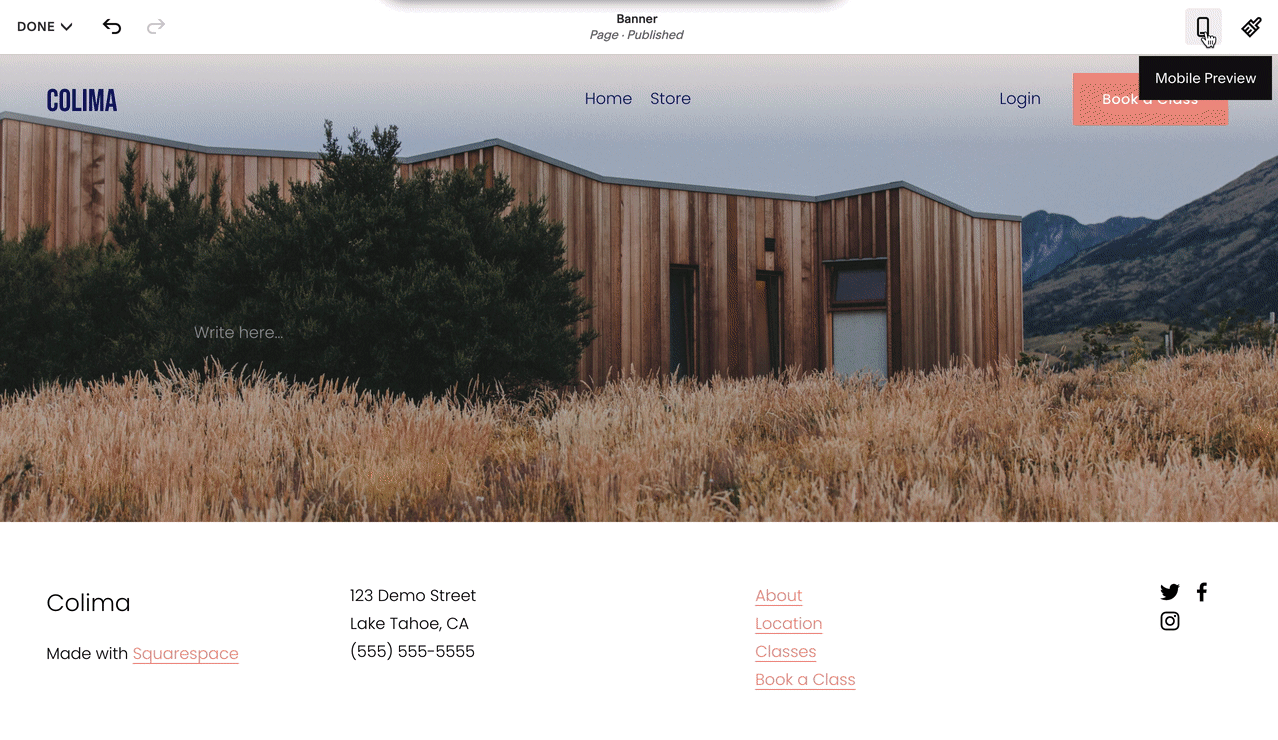
Mobile Display Example
E-commerce Features:
- Full shopping functionality on mobile
- Products display in vertical stack
- Cart icon location varies by version
- Category navigation adapts to mobile view
Mobile-Specific Considerations:
- Hover effects convert to tap actions
- Built-in mobile padding optimization
- Font sizes adjust automatically
- Phone numbers become clickable links
- Custom CSS may affect mobile display
For optimal mobile performance, maintain mobile styles enabled and regularly test your site across different devices.
Related Articles

How to Create a Website Header - A Complete Guide for Beginners