UI Design Guide: Choosing Fonts & Colors for Your Website
Fonts and colors set the tone for your website, creating a lasting first impression. Here's how to choose them effectively:
Selecting Fonts
Consider your brand's personality when choosing fonts. Serif fonts have small decorative lines at the ends of letters, while sans serif fonts feature clean, simple lines.
Sans serif fonts work well for digital displays due to better readability on screens. Choose serif fonts for traditional or elegant content, and sans serif for modern or minimalist designs.
When selecting fonts, consider:
- Your website's purpose and main message
- Target audience demographics
- Brand mood (playful vs. professional, modern vs. classical)

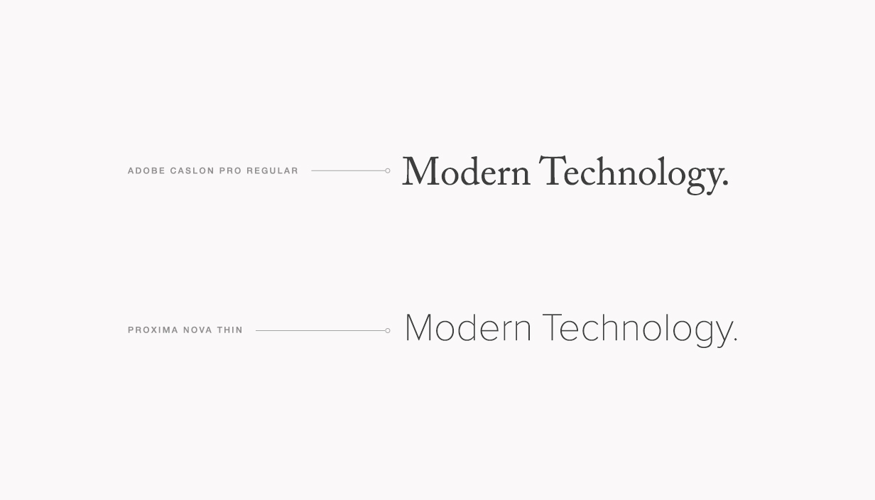
Two modern fonts compared
Font Pairing Tips:
- Limit yourself to two fonts for optimal readability
- Combine a serif with a sans serif font for contrast
- Use different text sizes to create hierarchy
- Maintain consistency across your site

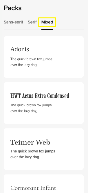
Font package list
Choosing Colors
Your color palette should reflect your brand's identity and content:
- Match colors to your industry (e.g., blues for beachwear, earth tones for nature)
- Draw inspiration from your logo or existing brand materials
- Consider your images' dominant colors
- Ensure sufficient contrast for readability
- Limit your palette to maintain visual harmony

Page to create a new event
Best Practices:
- Use high-contrast combinations for better accessibility
- Keep your color scheme simple and consistent
- Save bold colors for important elements like calls-to-action
- Test your design across different devices
- Consider your target audience's preferences
Remember that your website design should evolve with your brand while maintaining readability and professional appearance. Experiment with different combinations before finalizing your choices.
