Complete Guide to Aspect Ratios: Image Resizing Tips for Your Website
An aspect ratio describes the proportional relationship between an image's width and height, expressed as width:height (e.g., 3:2). Understanding aspect ratios is crucial for maintaining consistent image presentation across your website.
Understanding Aspect Ratios
- A square image has a 1:1 ratio (equal width and height)
- A portrait image might have a 2:3 ratio (height 1.5 times longer than width)
- Images can have different dimensions but maintain the same ratio (e.g., 500x500px and 1500x1500px are both 1:1)
Cropping Tips
- Use built-in image editors with preset aspect ratios
- For custom ratios, use third-party editors
- Crop the shorter side based on the longer side
- Avoid scaling up images to prevent blurriness

Two stacked white ceramic bowls
Special Considerations
Page Banners:
- Don't have preset ratios
- Stretch to fit various browsers
- Can often be adjusted for height
- Consistent ratios create uniform appearance
Product Images:
- Can be styled for store and product pages
- Uniform ratios create professional appearance
Videos:
- Uploaded videos maintain original ratio
- Most display in 16:9 player
- Embedded videos follow thumbnail ratio
- Gallery blocks may need ratio adjustment for proper display
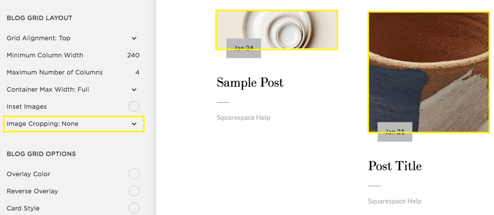
Image layout grid examples
Common Aspect Ratios Visualized:
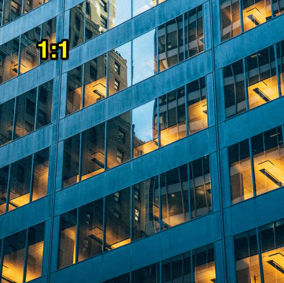
Modern glass office tower at night
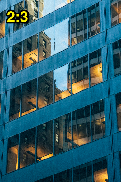
Building reflections in glass facade
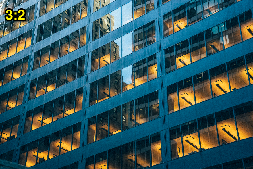
Glass office tower in city skyline
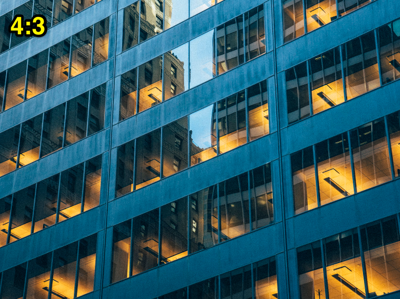
Modern glass office tower exterior
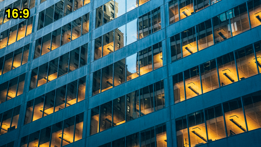
Close-up of modern glass building
Percentage-Based Ratios:
- 100% = Square (1:1)
- Below 100% = Landscape
- Above 100% = Portrait
- Calculate exact ratios by dividing height by width (e.g., 2:3 ratio = 150%)
Related Articles

Software Security Alert: Dangerous Malware Found in Template Customization Tools
