How to Style and Customize Your Site Navigation in Squarespace
Navigation styling allows you to customize the appearance and behavior of your site's navigation links. Navigation typically appears at the top of your site, though some templates support footer or sidebar placement.
Finding Navigation Style Options
For Version 7.1:
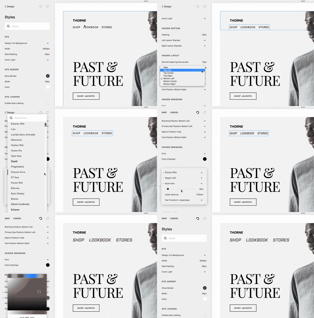
- Access navigation styles through the header editor
- Customize layout, colors, spacing, and mobile display
- Additional font and size options available in site styles
For Version 7.0:
- Open Design panel and click Site styles
- Look for tweaks containing "Navigation"
- Hover over navigation to highlight relevant style options

headshot of man wearing suit
Key Customization Options
Font and Size:
- Match or differentiate from site-wide font
- Adjust font family, weight, and style
- Set custom sizes using rem values or preset options
Colors:
- Edit through header editor (7.1) or site styles (7.0)
- Customize navigation links and social icons
- Set different colors for mobile header overlay
Layout and Spacing:
- Position links horizontally or vertically
- Adjust padding and spacing between links
- Template-specific layout options available
Mobile Navigation
- Collapses into menu icon (☰) or "Menu" text
- Customizable through header editor
- Inherits desktop styles for brand consistency
- Layout varies by template family
Template-Specific Features
- Different templates offer varying navigation positions
- Some support hover and active link states
- Mobile breakpoints vary by template
- Options to hide or customize mobile menu icon
Remember to keep navigation titles concise and consider using dropdowns to organize multiple links effectively for optimal mobile display.
Related Articles

Software Security Alert: Dangerous Malware Found in Template Customization Tools

