Mobile Design Options and Styles in Squarespace Version 7.0
Mobile devices require specific style options in Version 7.0 Squarespace templates to enhance personalization. All websites automatically adapt to any mobile device through responsive design.
To access mobile-specific adjustments:
- Open device view before entering Website Styles
- Use Ctrl+F (Command+F on Mac) to search "mobile device"
- Search "Min" for font scaling options
Template-Specific Mobile Options:
Aviator:
- Toggle background image visibility
- Adjust logo size (except Info pages)
Brine:
- Configure 1-2 navigation bars
- Set fixed top bar options
- Customize header icon styles and placement
- Adjust mobile breakpoint width
- Modify shop page design elements
Farro:
- Set up 1-2 navigation bars
- Configure fixed top bar
- Customize header icons and placement
- Modify shop page designs
- Toggle index page image grid titles
- Customize website title appearance
- Add separate mobile logo with height adjustment
Skye:
- Enable font scaling
- Customize shop page designs
- Switch between logo and website title
Tremont:
- Implement font scaling
- Set size variations for different devices
- Customize shop page elements
- Adjust website title styling
- Modify mobile navigation background
York:
- Enable font scaling
- Configure top mobile navigation
- Customize header icons
- Modify shop page designs
Key Mobile Style Features:
Font Scaling:
- Manually set maximum and minimum sizes for titles and headings
- Ensure readable text across devices
Logo Sizing:
- Reduce logo size on mobile to prevent cluttering
- Maintain brand visibility while optimizing space
Navigation Bars:
- Position at top or bottom of mobile view
- Include essential elements (logo, cart, search)
- Customize colors and element placement
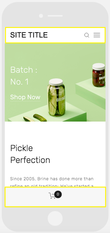
Jar on green background
Shop Page Customization:
- Style product titles, prices, and sale prices specifically for mobile
- Optimize shopping experience on smaller screens
Related Articles
Switch from Marquee to Brine: Template Guide and Migration Steps