Advanced Mobile Style Options Available for Squarespace 7.0 Templates
Advanced mobile styling options in Squarespace version 7.0 templates offer additional customization for responsive design. Here's what you need to know about mobile-specific adjustments.
To preview and adjust mobile designs:
- Open device-specific preview before accessing site styles
- Use Ctrl + F (Command + F on Mac) to search for "mobile" or "minimum"
- Adjust settings while previewing the mobile view
Template-Specific Mobile Options:
Aviator
- Toggle background image visibility
- Adjust logo size (except information pages)
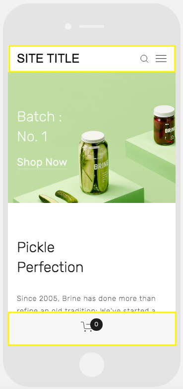
Brine
- Configure one or two mobile navigation bars
- Customize top bar settings
- Style header icons and positioning
- Set mobile view breakpoint width
- Customize store page styles
Farro
- Add mobile navigation bars (one or two)
- Customize top bar settings
- Style header icons and positioning
- Configure store page styles
- Hide index page thumbnail grid title
- Customize site title appearance
- Add separate mobile logo or display site title
Skye
- Adjust font scaling
- Customize store page styles
- Option to replace logo with site title
Tremont
- Configure font scaling
- Set size settings for different devices
- Customize store page styles
- Style site title
- Set mobile navigation background color
York
- Adjust font scaling
- Configure top mobile navigation
- Style header icons
- Customize store page styles
Green background with a white pickle jar
Key Mobile Style Features:
Font Scaling
- Set maximum and minimum sizes for titles, headings, and text
- Ensures readability across devices
Logo Sizing
- Adjust logo size for mobile displays
- Recommended to use smaller sizes for mobile viewing
Mobile Navigation Bar
- Appears at top or bottom of mobile site
- Includes site title/logo, shopping cart, and search
- Customizable colors and element positioning
- Some templates support dual navigation bars
Store Pages
- Custom styling for product titles, prices, and sale prices
- Template-specific options for mobile commerce display
These mobile-specific adjustments help create a seamless user experience across all devices while maintaining your site's visual identity.
Related Articles
Mobile Style Options in Squarespace 7.0: Template-Specific Guide