Mobile Style Options in Squarespace 7.0: Template-Specific Guide
Squarespace templates in version 7.0 offer specialized mobile styling options to enhance your site's appearance on smaller devices. Here's what you need to know about these mobile-specific customizations:
Finding Mobile Style Options:
- Use Preview by Device to see mobile changes in real-time
- Press Ctrl + F (Command + F on Mac) to search for "Mobile" in style settings
- Look for "Min" to adjust font sizing
Template-Specific Mobile Features:
Aviator:
- Adjustable logo size
- Toggle background image visibility
- Custom background color options
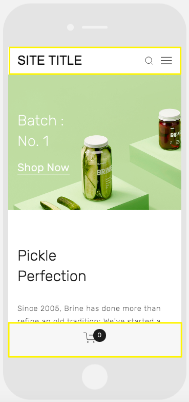
Brine:
- One or two mobile navigation bars
- Fixed top bar option
- Customizable header icon styles and placement
- Adjustable mobile breakpoint
- Store page styling options
Farro:
- Dual mobile navigation bars
- Fixed top bar option
- Custom header icon styles
- Adjustable icon placement
- Store page customization
- Optional grid title hiding for Index Pages
- Mobile-specific logo or site title options
Pickle jar on green background
Skye:
- Font size customization
- Store page styling
- Logo-to-site-title conversion option
Tremont:
- Responsive font sizing
- Device-specific size settings
- Store page customization
- Mobile navigation background color
- Site title customization
York:
- Adjustable font sizing
- Mobile top navigation bar
- Custom header icon styles
- Store page styling options
Key Mobile Style Features:
Font Sizing:
- Manual control over maximum and minimum text sizes
- Customizable settings for titles, headers, and body text
Logo Display:
- Reduced mobile logo size options
- Cleaner mobile presentation
Navigation Bars:
- Top or bottom placement options
- Customizable colors and elements
- Header component organization
- Unique mobile-specific styling
Store Pages:
- Mobile-specific styling for product titles
- Custom price display options
- Sale price formatting
These mobile customization options ensure your Squarespace site maintains professional appearance and functionality across all devices while providing optimal user experience.
Related Articles
Switch from Marquee to Brine: Template Guide and Migration Steps