Mobile Styling Features in Squarespace 7.0: Template-Specific Options & Customization
Advanced mobile style options let you customize how your Squarespace 7.0 site appears on mobile devices, beyond the default responsive design. Here are the key mobile customization options by template:
Aviator
- Toggle background image visibility
- Adjust logo size (except About pages)
- Customize background colors
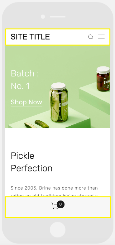
Brine
- Configure up to two mobile navigation bars
- Set fixed/scrolling top bar
- Customize header icon styles and positioning
- Adjust mobile breakpoint width
- Store page style customization
Farro
- Add one or two mobile navigation bars
- Set fixed/scrolling top bar
- Customize header icons and positioning
- Toggle Index Page thumbnail grid titles
- Customize site title appearance
- Add separate mobile logo or display site title
Pickle jar on green background
Skye
- Font scaling options
- Store page customization
- Logo/site title toggle
Tremont
- Font scaling
- Device-specific size settings
- Store page styling
- Site title customization
- Mobile navigation background color
York
- Font scaling
- Top mobile navigation bar
- Header icon styling
- Store page customization
Key Mobile Style Features:
- Font scaling: Set min/max sizes for headings and text
- Logo sizing: Optimize logo display for mobile screens
- Navigation bars: Customize top/bottom bars with header elements
- Store page styles: Unique mobile styling for product titles and sale prices
To access mobile options:
- Open Device View
- Access Site Styles panel
- Use Ctrl+F/Command+F to search for "Mobile" or "Min"
All templates maintain responsive design regardless of additional mobile customization options.
Related Articles
Switch from Marquee to Brine: Template Guide and Migration Steps