
Mobile-Optimized Web Design in Squarespace 7.0: Advanced Template Options
Mobile devices can display Squarespace sites differently from desktop views, with various template families offering specialized mobile customization options. All Squarespace sites automatically adapt to any device through responsive design, but version 7.0 templates provide additional mobile-specific adjustments.
Accessing Mobile Settings
- Use Device View to preview mobile changes
- Press Ctrl + F (Command + F on Mac) to search for "Mobile" in the Styles panel
- For font options, search for "Min"
Template-Specific Mobile Options
Aviator:
- Background image toggle
- Logo size adjustment (except Information Pages)
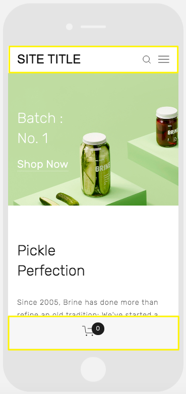
Brine:
- Configurable mobile navigation bars (up to two)
- Fixed top bar option
- Header icon styling and placement
- Mobile breakpoint customization
- Shop page styling
Farro:
- Dual mobile navigation bars
- Fixed top bar option
- Custom header icon styling
- Icon placement adjustments
- Shop page customization
- Index page thumbnail grid title toggle
- Site title styling
- Mobile-specific logo options
Skye:
- Font scaling
- Shop page styling
- Logo-to-site-title conversion
Tremont:
- Font scaling
- Multi-device size settings
- Shop page customization
- Site title customization
- Mobile navigation background color
York:
- Font scaling
- Top mobile navigation bar
- Header icon styling
- Shop page customization
Key Mobile Style Features
Font Scaling:
- Manual control over maximum and minimum text sizes
- Applies to titles, headings, and key text elements
Logo Sizing:
- Reduced mobile logo size recommended
- Helps maintain clean mobile layout
Mobile Navigation Bars:
- Position at top or bottom
- Contains site title/logo, cart, and search
- Customizable colors and element placement
A smartphone displaying a website
Shop Page Customization:
- Mobile-specific display options for product details
- Customizable product titles and pricing display
- Promotional price styling options
Related Articles
Switch from Marquee to Brine: Template Guide and Migration Steps