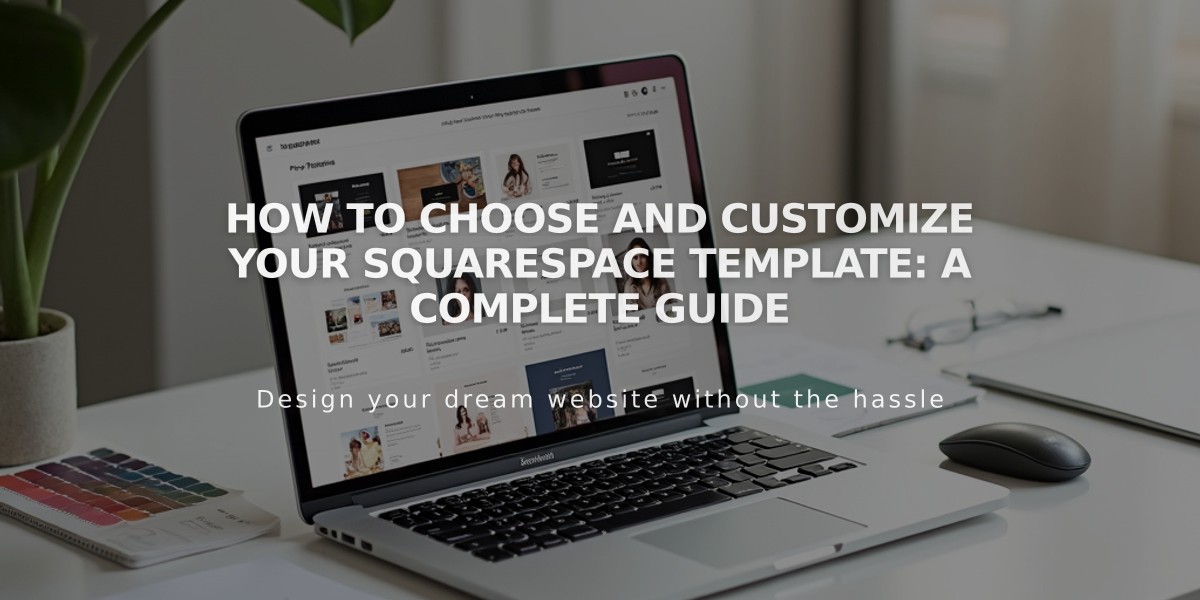
Advanced Mobile Style Options in Squarespace 7.0: Template Guide
Advanced mobile styles in version 7.0 templates offer specialized customization options for responsive design, ensuring your site looks great on any device. Here's what you need to know about mobile-specific customization options.
To access mobile tweaks, use device view and search for "Mobile" in site styles (Ctrl + F or Command + F on Mac). For font scaling options, search for "Min."
Template-Specific Mobile Options:
Aviator:
- Toggle background image visibility
- Adjust logo size (except info pages)
Brine:
- Configure one or two mobile navigation bars
- Fixed top bar option
- Custom header icon styles and positioning
- Adjustable mobile breakpoint width
- Store page customization options
Farro:
- One or two mobile navigation bars
- Fixed top bar option
- Custom header icon styles
- Adjustable icon placement
- Store page styling
- Index page thumbnail grid title visibility
- Site title color and font options
- Separate mobile logo with adjustable height
Skye:
- Scaling fonts
- Store page customization
- Logo/site title toggle
Tremont:
- Scaling fonts
- Multi-device size settings
- Store page styling
- Site title customization
- Mobile navigation background color
York:
- Scaling fonts
- Top mobile navigation bar
- Custom header icon styles
- Store page options
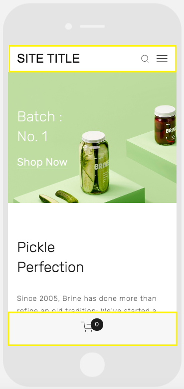
Mobile online store interface
Key Mobile Features:
Scaling Fonts:
- Set maximum and minimum sizes for titles, headings, and text
- Ensures readability across devices
Logo Sizing:
- Recommended to use smaller logos on mobile to prevent crowding
Mobile Navigation Bars:
- Customizable top or bottom placement
- Contains site title/logo, cart, and search
- Adjustable colors and element positioning
- Support for unique mobile styles
Store Page Customization:
- Mobile-specific styling for item titles
- Custom price and sale price displays
- Enhanced mobile shopping experience
These mobile customization options help create a seamless user experience across all devices while maintaining your site's design integrity.
Related Articles
Switch from Marquee to Brine: Template Guide and Migration Steps