Easy Site Preview Guide: How to View Your Site on Different Devices
See how your website appears across devices and preview changes before publishing.
Device Preview Options:
Computer preview shows desktop layout with full editing capabilities Mobile preview available through Squarespace app iPad view offers both desktop and mobile previews Full-screen preview mode hides editing panels for cleaner visualization
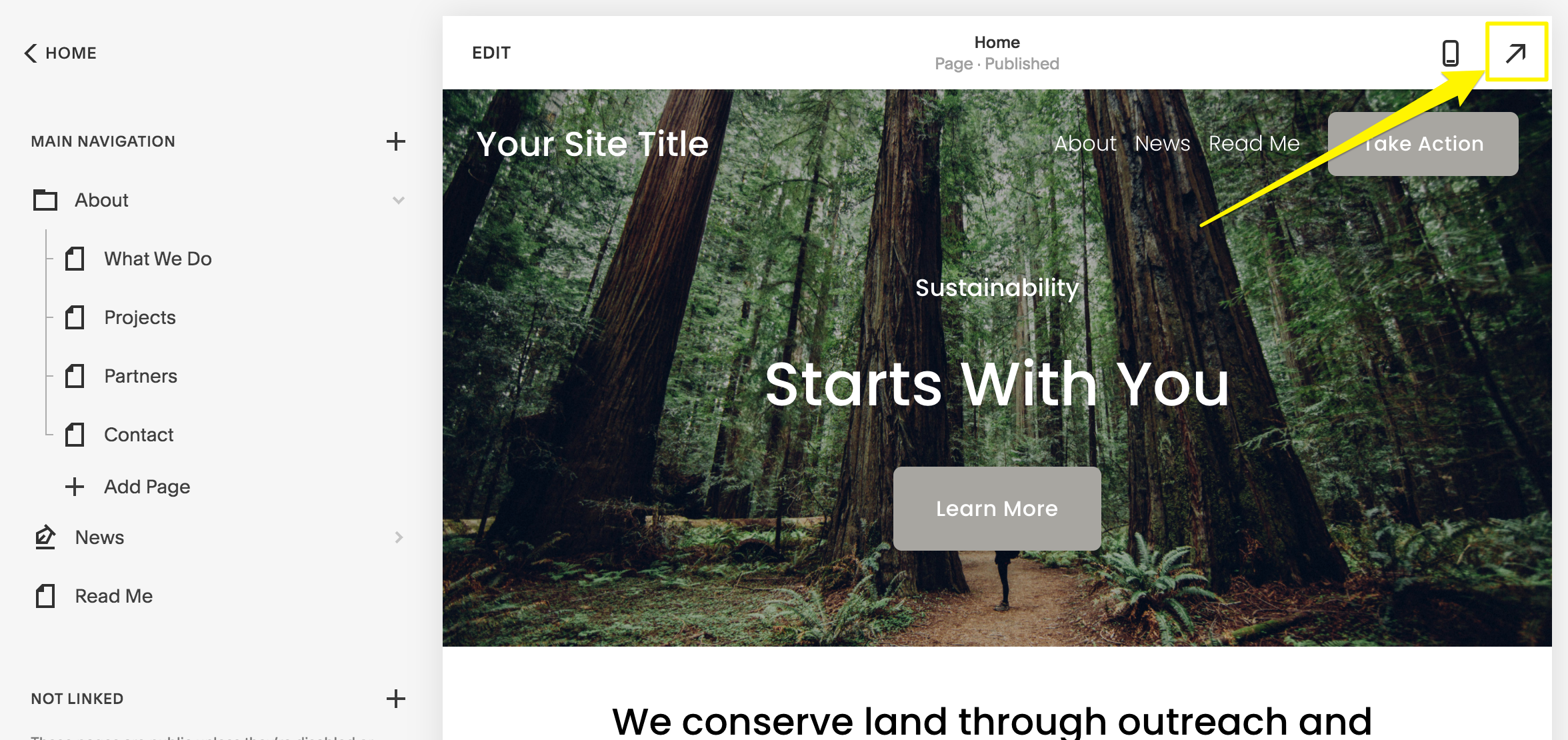
Yellow arrow pointing right
How to Preview Content:
- Desktop Users:
- Click the expand arrow in upper right corner
- View full-screen preview without editing annotations
- See actual page URLs in browser address bar
- Mobile Users:
- Tap preview bar at bottom to expand/collapse
- Use computer icon to switch between desktop/mobile views
- Edit content directly in preferred view
- Blog Post Preview:
- Save post as draft or publish
- Click post title in sidebar
- Use expand arrow for full preview
Advanced Preview Methods:
Private Browsing: View site as visitors see it, especially useful for embedded code Browser Zoom: Use Ctrl/⌘ with +/- to check wider layouts Device View: Test appearance across different screen sizes
Tips for Testing Changes Privately:
- Disable pages temporarily
- Add password protection to specific pages or entire site
- Move pages to Off Navigation section
- Test template changes before applying
- Create draft blog posts
These preview options ensure your content looks perfect before going live, maintaining professional presentation across all devices and platforms.
Related Articles
Switch from Marquee to Brine: Template Guide and Migration Steps