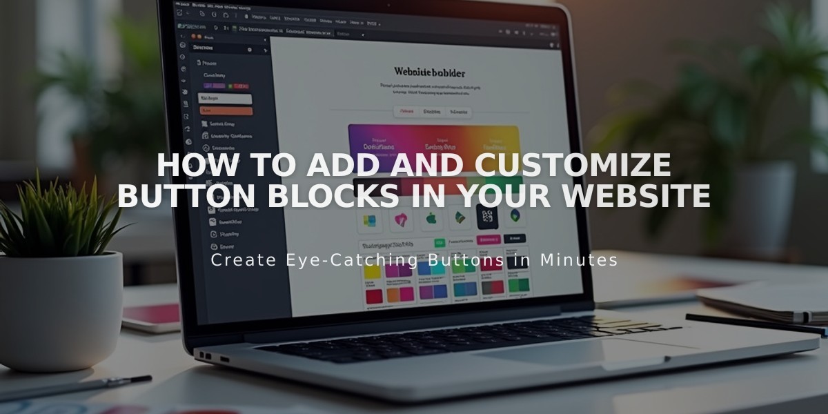
How to Add and Customize Button Blocks in Your Website
Button blocks create visually appealing calls to action that guide visitors to important content on your site. They can link to internal pages, external websites, downloadable files, email addresses, or phone numbers.
Adding a Button Block
- Edit a page or post
- Click Add Block or an insertion point
- Select Button from the menu
- Click the pencil icon in the block toolbar
- Enter button text (keep under 25 characters)
- Click Add Link and enter URL or select from dropdown options
Customizing Button Style
- Click Design tab
- Choose button type:
- Main Button (default)
- Secondary Button
- Tertiary Button
- Select button alignment (left, center, or right)
- Choose size (S, M, or L)
Advanced Styling Options
- Click the paintbrush icon while editing
- Under Buttons:
- Modify font
- Change shape
- Adjust size
- Under Colors:
- Set button colors
- Create color schemes using section themes
Button Block Settings
- Adjust padding or fill entire block (Intuitive Editor)
- Customize alignment
- Change size
- Modify color scheme
- Set button shape
Tracking Performance
Use Form and Button Conversions to:
- Monitor click rates
- Track conversion rates
- Compare views vs. clicks
- Analyze button performance
Remember to maintain consistent styling across your site for a professional appearance. Regular tracking helps optimize button placement and effectiveness for better user engagement.
Additional Features:
- Email address linking
- Phone number linking
- File downloads
- Internal/external page navigation
- Custom URL options
All changes save automatically when clicking outside the block editor.
Related Articles

Switch from Marquee to Brine: Template Guide and Migration Steps

