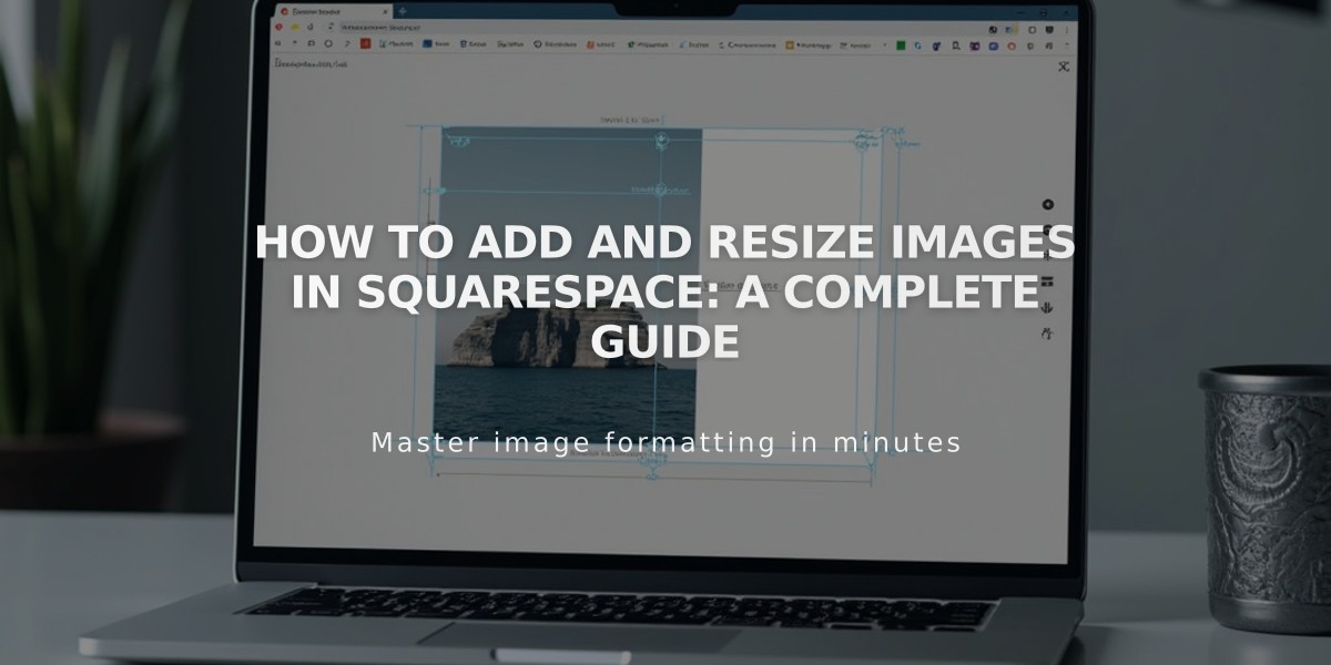
How to Add and Resize Images in Squarespace: A Complete Guide
Adding and Resizing Images
Images enhance your website by breaking up text, showcasing products, and highlighting your brand's personality. Learn how to effectively add and resize images on your site.
Ways to Add Images:
- Single images using image blocks
- Multiple images in gallery sections
- Custom layouts combining images, text, and buttons
- Background images for page sections
- Portfolio images for projects
- Branding elements (logo, social sharing logo, favicon)
- Blog post and collection images
- Product images with multiple angles
- Instagram feed integration
Resizing Options:
Fluid Editor:
- Drag directly on the page to resize
- Adjust width and height freely
Classic Editor:
- Add spacer blocks to reduce image width
- Adjust block arrangements for sizing
- Use cropping handles for height adjustment
Section-Specific Sizing:
- Gallery sections: Customize layout and style
- Portfolio pages: Adjust display settings
- Shop pages: Modify product image ratios
- Banner images: Control section height/width
- Logo: Fine-tune position and dimensions
Advanced Image Features:
- Alt text for accessibility and SEO
- Animations and hover effects
- Built-in image editing (crop, rotate, filters)
- Lightbox display options
- Clickable URLs
- Custom image shapes
- Interactive elements
Social Media Optimization:
- Use Squarespace's image resizing tool
- Preset sizes for major platforms
- Batch processing available
- Maintains original file format
- Easy .zip download
Tips for Success:
- Follow formatting guidelines for responsive design
- Use Resource Library to manage and reuse images
- Access stock photos through Unsplash and Getty
- Consider mobile display optimization
- Make images accessible with proper alt text
- Test images across different devices
Remember that all images automatically adjust for different screen sizes through responsive design, ensuring optimal viewing on any device.
Related Articles

How to Add Email Subscriptions to Your Blog: A Comprehensive Guide

