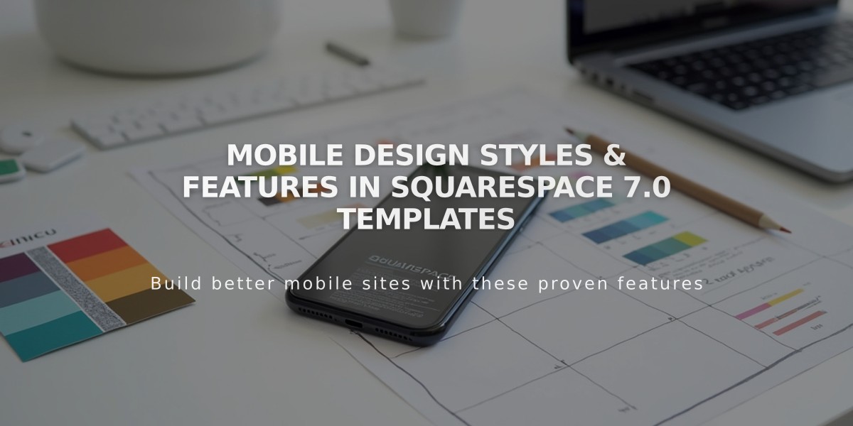
Mobile Design Styles & Features in Squarespace 7.0 Templates
Squarespace version 7.0 offers specialized mobile styling options for select templates, enhancing the default responsive design. Here's what you need to know about customizing your mobile experience:
Finding Mobile Settings:
- Use Ctrl + F (Command + F on Mac) to search for "Mobile" in site styles
- For font scaling options, search for "Min"
- Preview changes using device view
Template-Specific Mobile Options:
Aviator:
- Toggle background image visibility
- Adjust logo size (except on information pages)
Brine:
- Configure one or two navigation bars
- Set fixed top bar option
- Customize header icon styles and placement
- Adjust mobile breakpoint width
- Modify store page styles
Farro:
- Set up one or two navigation bars
- Configure fixed top bar
- Customize header icons and placement
- Control grid title visibility on index pages
- Add separate mobile logo or use site title
- Adjust store page styles
Skye:
- Enable font scaling
- Customize store page elements
- Option to replace logo with site title
Tremont:
- Implement font scaling
- Set different sizes for desktop, tablet, and mobile
- Customize store page styles
- Adjust mobile navigation background color
- Configure site title appearance
York:
- Enable font scaling
- Set top navigation bar options
- Customize header icons
- Modify store page styles
Key Mobile Features:
Font Scaling:
- Set maximum and minimum sizes for titles and headings
- Maintain readability across devices
Logo Sizing:
- Reduce logo size on mobile to prevent cluttering
Navigation Bars:
- Position at top or bottom
- Customize colors and element placement
- Include site title, logo, cart, and search features
- Support for dual navigation bars in some templates
Store Page Customization:
- Style item titles
- Adjust regular and sale price displays
- Create mobile-specific layouts
These mobile style options help create a better user experience while maintaining your site's design integrity across all devices.
Related Articles
Software Security Alert: Dangerous Malware Found in Template Customization Tools